The Design Dance: Matching Countertops and Backsplashes for Cohesion
The countertop and the backsplash are the power couple of the kitchen. When they work together harmoniously, they create a cohesive, stunning space. When they clash, the entire room can feel disjointed. Achieving the perfect pairing isn’t about matching everything exactly; it’s about achieving balance through a careful coordination of pattern, color, and finish.
At National Design Mart, our design experts guide homeowners through this crucial selection process. Here are the essential tips for mastering the art of matching your countertops and backsplash.
1. Identify Your Focal Point (The “Star” Rule)
The most important rule in this design pairing is to decide which element will be the star and which will be the supporting player.
- If the Countertop is the Star: This is the ideal approach when you choose a bold countertop with dramatic veining, rich colors, or an intricate pattern (like a statement marble or quartz). Your backsplash should then be a simple, subtle selection. Think classic subway tile in a solid neutral, a clean glass tile, or a solid surface that matches the cabinetry. This allows the countertop’s beauty to shine without visual competition.
- If the Backsplash is the Star: If you’ve fallen in love with a patterned tile, a detailed mosaic, or a vibrant color, your countertop should take a backseat. Opt for a countertop with a minimal pattern, a solid color (white, black, or light gray), or very gentle movement. This creates a clean foundation that makes the colorful wall tile pop.
2. Coordinate, Don’t Copy: The Undertone Secret
Matching your counter and backsplash doesn’t mean finding identical shades. Instead, focus on coordinating the undertones and secondary colors.
- Warm vs. Cool: Ensure both materials share the same color temperature. Warm countertops (featuring creams, golds, or brown veining) pair best with warm-toned backsplashes (like cream, taupe, or deep earthy colors). Cool countertops (featuring gray, blue, or violet veining) pair best with cool-toned backsplashes (like bright white, charcoal, or cool blue glass).
- Pulling a Secondary Color: If your granite or quartz countertop has flecks of a secondary color—a subtle gray or a hint of charcoal—choose a backsplash that echoes that exact color. This technique creates instant cohesion and a custom, well-thought-out look.
3. Play with Texture and Finish
Contrast in texture and finish is often the key to adding depth and preventing your space from looking flat or monotonous.
- Matte vs. Glossy: Pair a polished (glossy) countertop with a matte ceramic or stone backsplash for a nice textural break. Alternatively, a honed (matte) countertop looks fantastic contrasted against a high-gloss, light-reflecting glass or subway tile backsplash.
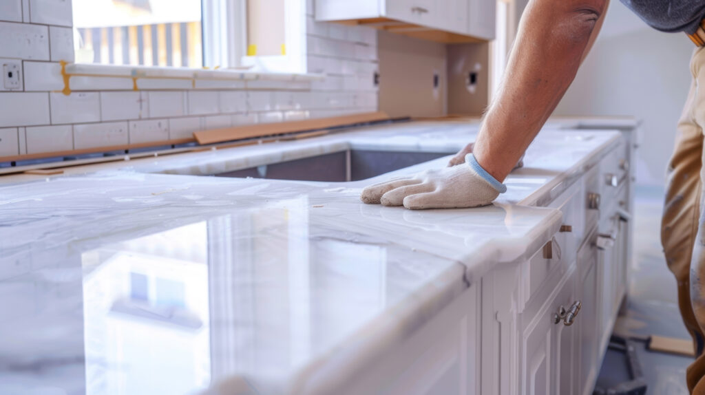
- Material Cohesion: A powerful modern trend is the solid surface backsplash, where the countertop material (often quartz or marble) is extended directly up the wall. This is the ultimate choice for a seamless, ultra-clean aesthetic that eliminates grout lines and emphasizes luxurious simplicity.
4. Always Check Samples in Your Space
Do not choose your materials based on how they look under the harsh lighting of a warehouse. Always take samples of your countertop, backsplash, and cabinet color home.
- Lighting is Key: View the samples in the natural light of your kitchen, and then check them under your recessed or pendant lighting. Light can dramatically change how colors appear. A warm white under cabinet light can make a cool gray tile appear beige!
Begin Your Perfect Pairing at National Design Mart in Northeast Ohio
Choosing a backsplash and countertop should be a fun, creative process. Whether you need a simple solution or a stunning, custom focal point, the design team at National Design Mart in Medina and Wooster has the extensive selection of quality materials to bring your vision to life. Stop by today and see the perfect pairings in person.